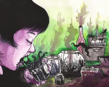
Walking the aisles of my local shop this week, Matt Fraction and Chip Zdarsky’s “Volume One” of Sex Criminals caught my eye. And not because it’s called Sex Criminals. This Image monthly about two people that freeze time when they have sex, and of course use this to rob banks, has been getting a lot of attention. Winning the Eisner Award for Best Continuing Series and Best New Series in one year is enough to get me interested, and it got good blurbs from USA Today and Time.
Upon first glance, it was the writing that caught my eye. Mostly I noticed there was no dearth of it. This was no visually centered book of one-liners, but something with a meaty script. The art seemed a little unexpressive at first glance, but I was willing to give it a chance. Matt Fraction was largely a Marvel man (I’m strictly DC, myself, for whatever such labels are worth) throughout his career, but I’d heard good things about everything he worked on, especially his run on The Immortal Iron Fist. Chip Zdarksky I hadn’t really heard of, except that he was the guy behind the short lived Applebee’s Internet meme, which I do have to admit I enjoyed very much. But the art seemed adequate, so I plopped the glossy collection on top of the stack of back issues I’d come for.
Like everything out there these days (except maybe Sandman Overture, which is pure perfection), there was good and bad. The humor stood out, characterized by quips and sharp wit. The sexually charged, tight dialogue made for a lot of one-liners. What I noticed pretty quickly was that I was wrong about the meaty script on my first impression. It was, in fact, a book of one-liners. Matt simply blocked a whole bunch of them in a row. All in all my impression was not one of depth, but one of surface. There were a lot of zingers but few passages of genuine humor.
One damn clever thing was Matt and Chip’s use of the 4th wall, or more properly their demolishment of it. Our narrator frequently takes asides, turning from action mid-frame and speaking to us directly about how we should be viewing her life. This occasionally goes a step deeper, with Matt himself speaking to us directly through the comic. This was used pretty smartly during an extended scene in which Matt placed Post-It notes over the scene’s dialogue and spoke about trying to get song rights for the collection. At the end of the collection, this whole “zero distance” thing is taken to the next level when Matt and Chip take us inside the creation of an issue, essentially removing the last boundary between the audience and the creator with a section aptly called “Makin’ Sausage.” More on that bonus material soon.
The 4th wall manipulation made for some hip story telling. Everything was immediate and very intimate, like I was being told a juicy piece of gossip by a close friend. Problem is, good stories aren’t told that way. Juicy gossip is. The whole thing suffered for the intimate vibe. Everything was edgy but nothing was ever epic or weighty, even in the personal lives of our characters. It just felt like nothing really mattered to them. They were just chatting about this funny thing that happened.
I have to admit, I’m a biased reader. I love the old archetypal reads, with bad guys and world changing crossovers. I’m a super hero kid, god help me. But I swear, I’m not trying to say that style of story telling is better. Not everything is about overcoming a menacing villain or some major self-discovery. But some level of self-discovery is necessary for a proper hero’s journey, and I never felt like we made it to that goal in “Volume One.”
Now to the art. This may not be my area of expertise, but there’s really no getting around it. The art was stiff. It wasn’t totally expressionless, but it didn’t bring out much substance. It stank of the digital pen, with the same pretty light steamer graphics we all loved playing with in Photoshop.
Going back to the “Makin’ Sausage” feature, I think it’s worth pointing out that the way Chip walks us through it, there is no hard paper stage of this comic. The layouts are made first in Photoshop, penciling is done in Manga Studio with a Cintiq pen display. Inks are also in Manga Studio, and the colors are done by a color flatter. Then the special effects are rendered and the lettering added. Now I’m not trying to say that this is the reason the art fell flat to me. All I’m saying is the art doesn’t look organic, it looks stiff, and it might help if a real pencil had a little play.
–Eliot Ridenour